Track progress, take quizzes and save notes on this lesson.

Free forever · no card needed

Start free
Foundational

Scatter Graphs and Sampling

S1·S6

Aligned to the Pearson Edexcel 1MA1 specification

Level
Foundational
Reading time
6 min
Published
12 June 2026
Updated
1 July 2026
On this page
  1. 1.Sampling — Methods and Limitations (S1)
  2. 2.Inferring from Samples (S1)
  3. 3.Scatter Graphs and Correlation (S6)
  4. 4.Line of Best Fit (S6)
  5. 5.Describing Scatter Graphs in Context
  6. 6.Common Exam Mistakes

Key takeaways

  • Correlation describes an association between two variables - it does not prove that one causes the other. Always distinguish between correlation and causation in exam answers.
  • A line of best fit should have roughly equal numbers of points above and below it and should pass through or near the mean point. It does not need to pass through the origin or any data point.
  • Interpolation (predicting within the data range) is reliable; extrapolation (predicting beyond the data range) is unreliable because the trend may not continue.
  • For stratified sampling, divide each subgroup size by the total population size, then multiply by the required sample size to find how many to select from each subgroup.

Sampling — Methods and Limitations (S1)

A population is the entire group being studied. A sample is a subset used when it is impractical to study the whole population.

Good sample requirements:

  • Representative: reflects the full variety of the population
  • Random: every member has an equal chance of selection
  • Adequate size: larger samples are more reliable

Sampling methods:

MethodDescriptionLimitation
Simple randomEvery member equally likelyCostly if population is large
SystematicEvery th member (e.g. every 10th person)May miss patterns with period
StratifiedSample from each subgroup in proportion to sizeRequires knowledge of subgroup sizes
Opportunity/convenienceThose who are availableLikely biased — not representative

Worked example — a school of 600 students: 200 in Year 10, 400 in Year 11. A stratified sample of 30 is required.

Year 10: students. Year 11: students. ✓

Limitations: sample results may not perfectly represent the population due to random variation, sampling bias, or non-response.

Inferring from Samples (S1)

Data collected from a sample is used to infer properties of the population. The reliability of inference depends on:

  1. Sample size: larger samples → less random variation → more reliable estimates
  2. Sample representativeness: a biased sample produces biased inferences regardless of size
  3. Variability in the population: high variability requires a larger sample to estimate reliably

Worked example — a random sample of 50 light bulbs from a batch shows 3 defective. Estimate the number of defective bulbs in a batch of 2000.

defective bulbs (expected). ✓

Caution: this is an estimate — the actual number may differ. A larger sample would give a more reliable estimate.

Scatter Graphs and Correlation (S6)

A scatter graph (scatter diagram) plots two variables for each data item — one on each axis.

Correlation describes the relationship between the variables:

TypeDescriptionExample
Strong positiveAs increases, increases; points close to a lineHeight and weight
Weak positiveGeneral upward trend but scatteredShoe size and income
No correlationNo clear patternHair length and intelligence
Negative correlationAs increases, decreasesSpeed and journey time

Correlation does not imply causation. Two variables may be correlated because of a hidden third factor, or simply by coincidence. Stating that one causes the other requires further evidence beyond the scatter graph.

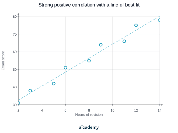
Worked example — a scatter graph shows a strong positive correlation between hours of revision and exam score. This means they are associated — it does not prove that more revision causes higher scores (though it suggests it).
Line of Best Fit (S6)

A line of best fit is a straight line drawn through the scatter plot to represent the trend. It does not have to pass through any data point.

Rules for drawing:

  • Roughly equal numbers of points above and below the line
  • The line should pass through (or very near) the mean point — this is the balancing point of the data
  • Do not extend beyond the range of the data unless asked

Making predictions (interpolation): read off the -value for a given -value from the line, where the -value is within the range of the data. Interpolation is reliable.

Extrapolation: predicting beyond the range of the data using the trend line. Extrapolation is unreliable because the trend may not continue.

Worked example — a line of best fit passes through and . Estimate the -value when .

Gradient: . Equation: .

At : ✓ (interpolation — is within the data range)

At : (extrapolation — may not be reliable)

Studying this for an exam?

Generate a personalised learning path for this subject. Free to get started.

Create a learning path

Describing Scatter Graphs in Context

Exam questions often ask you to describe and interpret scatter graphs. Use this structure:

  1. Type of correlation: positive/negative/no correlation, strong/weak
  2. Context: state what this means in the real-world context of the variables
  3. Causation caveat: note that correlation does not prove causation if relevant

Worked example — a scatter graph shows the age of a car (years) against its value (£).

"There is a strong negative correlation between the age of a car and its value. As the car gets older, its value decreases. This suggests that older cars tend to be worth less, though other factors such as mileage and condition also affect value."

Common Exam Mistakes

1. Describing correlation — confusing strength with direction

"Strong" and "positive/negative" are independent descriptions. A weak negative correlation means a general downward trend but with a lot of scatter. State both.

2. Causation claim from correlation

Stating "more revision causes higher exam scores" based solely on a scatter graph oversteps the data. Say "there is a positive correlation" or "there is an association" — not "causes."

3. Line of best fit — forcing it through the origin

The line of best fit should fit the data, not pass through the origin unless the context genuinely requires it (e.g. a conversion graph). Draw it where it fits best.

4. Extrapolation — treating it as equally reliable as interpolation

The further beyond the data range a prediction extends, the less reliable it is. Identify when a prediction is extrapolation and state the limitation.

MistakeCorrection
"Strong correlation proves causation"Correlation shows association; proving causation requires controlled experiments
"Line of best fit must pass through as many points as possible"It should balance above and below equally — most points will not lie on it
"Predicting outside the data range is fine"Extrapolation may be unreliable; trends may not continue

Key terms

Population
The entire group being studied from which a sample is taken.
Sample
A subset of the population selected to represent the whole when studying everyone is impractical.
Stratified sampling
A method where the population is divided into subgroups and members are selected from each in proportion to their share of the total.
Correlation
A statistical association between two variables shown on a scatter graph; described by direction (positive or negative) and strength (strong or weak).
Line of best fit
A straight line drawn through a scatter graph to represent the trend, with roughly equal numbers of points above and below it.
Interpolation
Using a line of best fit to predict a value within the range of the data; considered reliable.
Extrapolation
Using a line of best fit to predict a value beyond the range of the data; unreliable because the trend may not continue.

Frequently asked questions

Interpolation means reading a value from a line of best fit within the range of the data - it is reliable. Extrapolation means extending the line beyond the data range to predict values - it is unreliable because the trend may change.

State the direction (positive or negative) and the strength (strong or weak), then describe what this means in the context of the variables. Add that correlation does not prove causation if relevant.

Multiply the required total sample size by the fraction that each subgroup represents of the whole population. For example, if a group is 200 out of 600 and the sample is 30, select 200/600 x 30 = 10 from that group.

Generate revision on any topic you study

Type any topic you're studying and Aicademy generates a complete lesson, quiz, and flashcard set, personalised to your level.

Lessons on anything

Structured, level-matched lessons on any topic you study

Practice quizzes

Find out what you actually know before the exam does

Flashcard sets

Lock in key concepts with instant revision cards

Ask Aica

Stuck on something? Get a clear explanation, any time

Prev

Data Representation and Averages

Next

Circle Theorems

Related lessons

6 min

Lesson

Data Representation and Averages

Edexcel GCSE Mathematics · Pearson Edexcel 1MA1

1 month ago

Top students don’t revise more. They revise what counts.

Start revising free

Free to start. No card needed.