Data Representation and Averages

Aligned to the Pearson Edexcel 1MA1 specification
- Topic
- Statistics
- Level
- Foundational
- Reading time
- 7 min
- Published
- 12 June 2026
- Updated
- 16 August 2026
On this page
- 1.Charts and Graphs for Categorical and Discrete Data (S2)
- 2.Mean, Median, Mode and Range (S4)
- 3.Grouped Data — Estimates from Class Intervals (S4)
- 4.Histograms and Cumulative Frequency (S3 Higher)
- 5.Box Plots and Interquartile Range (S4 Higher)
- 6.Applying Statistics to Describe Populations (S5)
- 7.Common Exam Mistakes
Key takeaways
- For a pie chart, calculate each sector angle as (frequency / total) x 360 degrees; angles must sum to 360.
- The mean from a frequency table is sum of (f x x) divided by sum of f; for grouped data use the class midpoint, not the boundary.
- A histogram plots frequency density (frequency divided by class width) on the vertical axis, not frequency; bar area represents frequency.
- The IQR is Q3 minus Q1 and measures the spread of the middle 50% of data; the range is maximum minus minimum.
- When comparing two distributions, comment on both the median (typical value) and the IQR (spread), not just one measure.
Histograms and Cumulative Frequency (S3 Higher)
Histograms are used for continuous grouped data. The vertical axis shows frequency density, not frequency.
Equal class widths: bars are equally wide; areas are proportional to frequencies.
Unequal class widths: you must use frequency density so that area still represents frequency correctly.
Worked example — class , frequency 15, width 10. Frequency density ✓
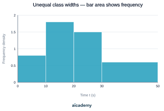
Cumulative frequency graphs: plot cumulative frequency against the upper class boundary. Use to read off the median (at ), quartiles (at and ), and percentiles.
Median from cumulative frequency graph — for values: read off the value at cumulative frequency 30 on the vertical axis.
Something not quite clicking?
Ask Aica to explain any part of this differently. Free, takes 30 seconds.
Box Plots and Interquartile Range (S4 Higher)
A box plot (box-and-whisker diagram) displays the five-number summary:
Interquartile range (IQR): — the spread of the middle 50% of data.
Reading quartiles from ordered data or cumulative frequency:
- : value at position (use for small discrete datasets — both methods are accepted)
- : value at position (use for small discrete datasets)
Worked example — ordered data: 3, 5, 7, 9, 11, 14, 16, 20 ().
: position nd value . : position th value .
Median: mean of 4th and 5th values . . ✓
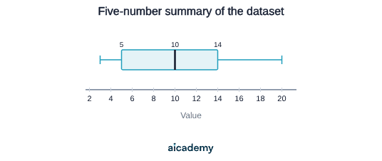
Comparing distributions: use the median (centre) and IQR (spread) to compare two datasets. A higher median means a higher typical value; a higher IQR means more variability.
Key terms
- frequency density
- The value plotted on the y-axis of a histogram, calculated as frequency divided by class width, so that bar area equals frequency.
- interquartile range (IQR)
- IQR = Q3 - Q1; the spread of the middle 50% of a dataset, used to compare variability between distributions.
- cumulative frequency
- A running total of frequencies up to and including each class boundary, plotted to find medians and quartiles.
- modal class
- The class interval with the highest frequency (or highest frequency density in a histogram); used when data is grouped.
- outlier
- A data value that is much larger or smaller than the rest of the dataset; it distorts the mean but not the median.
Frequently asked questions
A histogram is for continuous grouped data and plots frequency density (frequency / class width) on the y-axis, so bar area equals frequency. A bar chart plots frequency directly and is used for discrete or categorical data.
Read across from n/2 on the vertical axis to the curve, then down to the horizontal axis. For 60 values, read off at cumulative frequency 30 to find the median.
The mean uses every value in its calculation, so a very large or small outlier shifts the total. The median is the middle value of ordered data and is unaffected by how extreme the outliers are.
Generate revision on any topic you study
Type any topic you're studying and Aicademy generates a complete lesson, quiz, and flashcard set, personalised to your level.
Lessons on anything
Structured, level-matched lessons on any topic you study
Practice quizzes
Find out what you actually know before the exam does
Flashcard sets
Lock in key concepts with instant revision cards
Ask Aica
Stuck on something? Get a clear explanation, any time
Combined and Conditional Probability
Scatter Graphs and Sampling
Related lessons
7 min
6 min
Direct and Inverse Proportion, and Rates of Change
Edexcel GCSE Mathematics · Pearson Edexcel 1MA1
4 months ago