Data Presentation, Levels of Measurement and Correlation

Aligned to the AQA 7182 specification
- Topic
- Research methods
- Level
- Intermediate
- Reading time
- 10 min
- Published
- 1 July 2026
- Updated
- 16 August 2026
On this page
Key takeaways
- There are three levels of measurement: nominal (named categories/counts), ordinal (ranked data with unequal intervals) and interval (a scale with equal, fixed intervals). Interval is the most precise.
- Bar charts show discrete or categorical data with gaps between the bars; histograms show continuous data with the bars touching and no gaps, and the x-axis divided into equal intervals.
- A scattergram displays a correlation between two co-variables, with each point representing one pair of scores.
- A correlation coefficient is a number between -1 and +1: the sign shows direction and the distance from zero shows strength, so -0.8 is a stronger correlation than +0.4.
- The level of measurement determines which descriptive statistics and inferential tests are appropriate, so identifying it correctly is the first step in data analysis.
Histograms and Scattergrams
A histogram displays continuous data — data that can take any value along a scale, such as reaction times or ages. Because the x-axis is a continuous scale divided into equal intervals, the bars touch with no gaps. The area of each bar represents the frequency of scores falling in that interval.
The contrast with the bar chart is deliberate. Gaps mean separate categories; touching bars mean an unbroken continuous scale. If you draw a histogram with gaps, you have contradicted the very thing a histogram is for.
A scattergram is used to display a correlation between two co-variables. Every point plots one participant's pair of scores: their value on one co-variable against their value on the other. The overall pattern of the points shows whether the two co-variables rise together, move in opposite directions, or show no relationship.
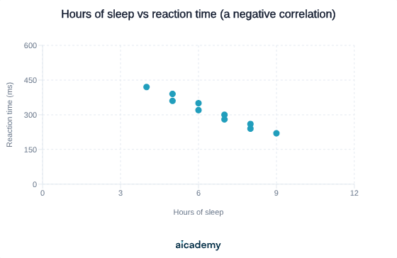
Here the points trend downwards from left to right: more sleep is associated with faster (lower) reaction times, so this is a negative correlation.
Want more lessons like this one?
Generate lessons on anything you study. Free account, no card needed.
Key terms
- Nominal data
- Data in the form of named categories, recorded as counts or frequencies of how many cases fall into each category.
- Ordinal data
- Data that can be ranked or ordered but with unequal intervals between the points on the scale, such as ratings out of 10 or positions in a race.
- Interval data
- Data measured on a scale with equal, fixed intervals between points, such as temperature or time in seconds; the most precise level of measurement.
- Bar chart
- A graph used to display discrete or categorical data, in which the bars are separated by gaps and the height of each bar shows frequency or a mean.
- Histogram
- A graph used to display continuous data, in which the bars touch with no gaps and the area of each bar represents the frequency in that continuous interval.
- Scattergram
- A graph used to display a correlation between two co-variables, in which each point represents one pair of scores.
- Correlation coefficient
- A number between -1 and +1 that summarises the strength and direction of the relationship between two co-variables.
Frequently asked questions
A bar chart displays discrete or categorical data and has gaps between the bars. A histogram displays continuous data, so the bars touch with no gaps and the x-axis is divided into equal continuous intervals.
A correlation coefficient runs from -1 to +1. The sign shows the direction (+ positive, - negative) and the distance from zero shows the strength. A value near +1 or -1 is a strong correlation; a value near 0 shows little or no correlation.
No. A coefficient of -0.9 is a very strong correlation. The minus sign only tells you the direction (as one co-variable rises, the other falls). Strength is judged by how close the value is to 1, ignoring the sign.
Generate revision on any topic you study
Type any topic you're studying and Aicademy generates a complete lesson, quiz, and flashcard set, personalised to your level.
Lessons on anything
Structured, level-matched lessons on any topic you study
Practice quizzes
Find out what you actually know before the exam does
Flashcard sets
Lock in key concepts with instant revision cards
Ask Aica
Stuck on something? Get a clear explanation, any time
Descriptive Statistics and Distributions
Statistical Testing: The Sign Test and Significance
Related lessons
9 min
11 min
11 min